Log In
Discover
Assets
Jobs
Behance
Pro
Hire Freelancers
Download on the App Store
Get it on Google Play
English
Čeština
Dansk
Deutsch
Español
Français
Italiano
Nederlands
Norsk
Polski
Português
Pусский
Suomi
Svenska
Türkçe
日本語
한국어
中文(简体)
中文(繁體)
About
Blog
TOU
Privacy
Community
Help
Do not sell or share my personal information
Sign Up
Skip to Main Content
Skip to Footer
Behance
Behance
Navigate to behance.net
Explore
Assets
Jobs
Behance
Pro
Hire Freelancers
search
magnifying glass
Sort & filter all:
Projects
Images
People
Assets
People to Hire
Cancel
search
magnifying glass
View your notifications within Behance.
View your notifications within Behance.
Log In
Sign Up
search
magnifying glass
Adobe, Inc.
Adobe, Inc.
Navigate to adobe.com
Jacob T
India
Follow
Message
Stats
Project Views
16,404
Appreciations
452
Followers
90
Following
54
Member Since: August 27, 2007
Report
Info
Work
Moodboards
Appreciations
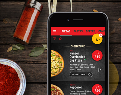
Pizza Hut Mobile design
Multiple Owners
79
1.1k
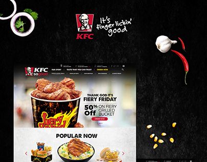
KFC India
Multiple Owners
9
381
Pizza Hut Desktop Website
Multiple Owners
22
727
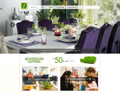
Q Home Decor
Multiple Owners
8
631
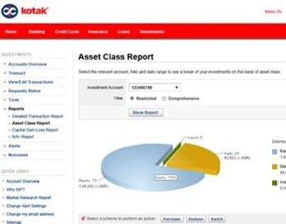
Kotak Wealth
Multiple Owners
5
370
Kotak Netbanking
Multiple Owners
0
414
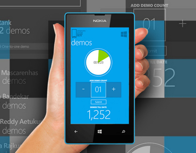
Microsoft F2F
Multiple Owners
10
1.2k
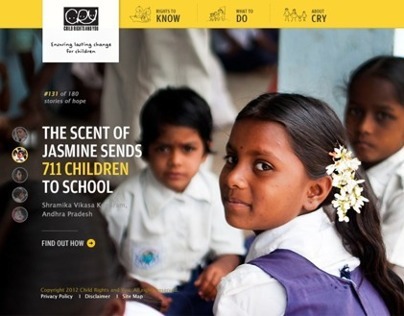
CRY
Multiple Owners
69
2.6k
FHM India
Multiple Owners
10
745
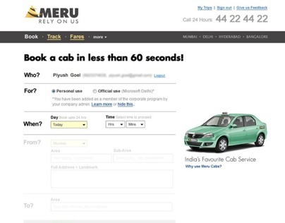
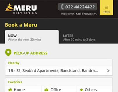
Meru Cabs
Multiple Owners
3
441
Meru Mobile Landing Page
Multiple Owners
4
263
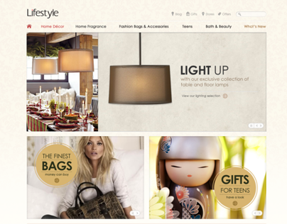
Landmark Lifestyle
Multiple Owners
7
642